

Believe it or not MS Excel is the backbone of analytics. Almost all the day to day web analysis and reporting are done in MS Excel and learning Excel techniques to improve productivity will make your life lot easier.
In this post, we will cover the most important Excel features and tricks to improve the web analytics productivity.
Tip#1 Correlation Analysis
Web data analysis comes with its own set of data inconsistencies and irregularities that cannot be explained by simple math. Sometimes you may notice that your website bounce rate changes with the day of the week, and sometimes the conversion rate will change with traffic. This happens when one data set (visits) shares positive or negative relationship with another data set (conversion).
Pearson’s correlation is the best way to measure the positive and the negative correlation of data to rule out the data inconsistencies and establish a baseline.
MS Excel 2007 is equipped with Correlation function and can be used to perform a quick analysis.
Let’s assume that we want to see the relationship between the daily visits and the website conversion.
a. Enter the visit and the conversion data on the Excel spreadsheet.

b. Place the cursor on any empty cell in the spreadsheet. This cell will be used to display the Pearson’s correlation coefficient. Press F2 to enter the formula for correlation and type “=Correl” and hit Tab key.

c. Once you hit the Tab key, the cursor will be placed in the bracket, and you will be allowed to select the array data. Select your first data column (avg. daily visits) for the array1 and second data column (avg. daily conversion) for the array2. Close the bracket and then hit the Enter key.

d. The value displayed in the cell (0.963240336) will be the correlation between the avg. daily visits and avg. daily conversion. In this case, the daily visits show a high positive correlation with conversion (greater than zero is positive and less than zero is negative. Zero is no correlation).

Tip#2 Control Limits
We have discussed control limits on this blog before, but I could not resist talking about it once again because it is extremely important. Establishing control limits for your data set allows you to measure the trends in your web metrics effectively.
Your website traffic/conversion/bounce rate can fluctuate due to multiple uncontrollable environmental factors. You could see a spike in traffic due to a viral campaign or see a drop in conversion because of shopping cart errors. In any case, your job as a web analyst is to identify a true trend and eliminate noise from data.
Calculating the upper and lower control limit (UCL & LCL) using Excel will allow you to establish a trend benchmark for your key metrics. Using this data, you can focus on when to take action about the data.

Here are the steps to calculate the UCL and LCL for web traffic data.
a. Enter the ninety day daily visits day on the Excel spreadsheet and calculate the Standard Deviation in an empty cell. (hint: For accurate UCL and LCL calculations, it is advisable to have atleast 90 data points).
Excel Standard Deviation formula = STDEV(number1,number2,..,numberN)

b. Calculate the Mean for the data.
Mean = Average(number1,number2,…,numberN)

c. Finally, calculate the upper and the lower control limits. The control limits can be later applied to the weekly/monthly trend graph.
Upper Control Limit (UCL) = Mean + Standard deviation
Lower Control Limit (LCL) = Mean – Standard deviation

Tip#3 Data Comparison using Vlookup
VLookup is one of the most powerful Excel functions that you can use to match / compare data between two Excel sheets. Vlookup can be used to match/compare the data between either the same or across different Excel spread sheets. The possibilities of using Vlookup function are endless. You can pull data from different sources and populate the fields based on a matching column. For example – data from your CRM solution can be connected to the data from web analytics provided you have one common column (visitor id) between the two spreadsheets.
Here is a short Youtube video that shows how to import value from one spreadsheet to another using Vlookup.
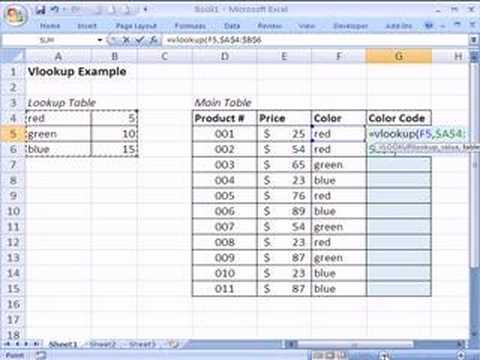
Source: YouTube user
Tip# 4 Pivot Tables
Summarizing data from a large Excel spreadsheet is extremely difficult when dealing with multiple variables and filters. The excel Pivot Table feature allows you to summarize the data really quickly. The filter functionality of the Pivot table can be used to filter the data for multiple values, i.e. lead type, date, campaign source, campaign medium.
There are two ways to create a Pivot Table in MS Excel. You can either add the Pivot Table on the same spreadsheet or create the table on a new spreadsheet. I prefer creating the table on a new sheet because it is clean and easier to sue. To create the Pivot Table on a new sheet, open the Excel data file, place the cursor on a filled data cell (placing the cursor on an empty data cell will add Pivot Table to the same sheet), click “Insert” tab and then click “PivotTable” button in MS Excel 2007.

The Pivot Table action box will popup, and the “Table/Range” field will be automatically prepopulated with the table range.

Click “OK” and you will be taken to a new sheet with the Pivot Table.

Pivot Table consists of three sub sections.
a. PivotTable display area – Empty area on the left where the Pivot Table will be displayed.
b. Pivot Table field list – This is the list of the columns from the data spreadsheet.
c. Table customization areas – Table customization consists of four areas –
1. Report Filter: Report filter allows you to filter the table using any column. In this example, you can filter the table by Date, Day, Campaign source and Lead type. Simply, drag and drop the column from the field list to the filter area.
2. Row Labels: This area allows you to add the rows for the Pivot Table.
3. Column Labels: This area allows you to add the columns for the Pivot Table.
4. Values: This is where you can add the amount of the total sales and any other calculation you want to look at.
Once you drag and drop the columns in the respective areas, here is how the final table will look like. You can then easily filter the table by date, day or lead type.

Tip#5 Unique Records Advanced Filter
This is the easiest of all the Excel tricks and one of the most useful. As a web analyst, you will constantly come across multiple visit data for the same visitor in any given period of time. Unique record filter allows you to filter out the duplicate records from the data.
Here are the steps to use the unique record filter to remove the duplicate visitor ids from the sample data –
1. Select the column with the duplicate records (Visitor id)
2. Click the “Data” tab in MS Excel 2007
3. Click “Advanced” in “Sort & Filter” section

4. Click “Unique records only” check box and hit “Enter”.

The final data will only show one instance of the Visitor id.
Hope you enjoyed the post. Please share your thoughts, insights and comments below. Your feedbacks are helping me become a better blogger. Thanks!
Here is a list of the related top blog posts on this blog –
Top 10 Outrageous Web Analytics Myths..Debunked
Ultimate Web Analytics Training Guide: From Click to Close
Facebook vs Google & Google Analytics – Final Round??
Top 3 Worst Web Analytics Metrics & Reports


")
Really nice posting. When working with control limits you have to be careful with time-ordered data, though. Underlying seasonal trends could cause limits to be fundamentally incorrect. It might be better, if the data exhibit seasonality, to define a centered moving average and then check the limits on the residuals (difference of actual and predicted values).
Cheers,
J
Hello John,
Yes I agree. Seasonality could impact the upper and the lower control limit number. As a best practice, users should exclude the seasonal event data from the control limit calculation. I like your suggestion of using moving average to keep the limits in check. It is a pretty nice idea for another blog post :).
Thanks
Sameer