

Data visualization search volume has gone through an interesting reverse cycle. This is one of the few segments which has picked up after a drop mainly due to an uptrend in the big data industry. Visualizing data has taken a new meaning not only as a means of analyzing data but a form of art.
With that said, here are some of the best visualizations of data including some award winning ones for your to review and share.
1. Popularity of Facebook usage – Instead of showing tables of data, the author created a visual image showing the usage pattern of Facebook. The intensity of the light indicates the popularity of the Facebook usage.

Source : http://sweb12.hciresearch.org/content/data-visualization-age-big-data
2. Hurricane Sandy – This is an interactive visualization of the Hurricane Sandy from initial landfall to aftermath.

Source : http://hurricanesandy.censusviewer.com/client
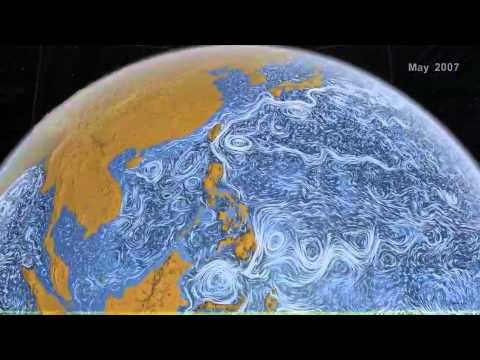
3. NASA’s Perpetual Ocean – A video visualization of the worldwide ocean currents compiled by NASA using data from the satellites (June 2005 to December 2007)
4. Browser market share (Jan 2002 to Aug 2009) -An interactive visual representation of browser market share from Jan 2002 to August 2009. You can play with the interactive version here.

Source : http://www.axiis.org/examples/BrowserMarketShare.html
5. Flickr Maps – The author of this graphic used Flickr geo tagged data to produce this stunning map. The idea is to connect the location where the photo was taken and connect the dots with other locations.

Source : http://polymaps.org/ex/flickr.html
6. Asteroid discovery – Another video visual compilation of the asteroid discovery from 1980 to 2010. This visual has been developed by Scott Manley of the Armagh Observatory.

7. Instagram photos – Phototrails is a visual representation of millions of Instagram photos. The graph shows large volume of photos in one view in each of these cities.

8. BP Oil spill – Here is an immersive (3-D made from 2-D) simulation of the BP oil spill flow through water. The visual is prepared using computational fluid dynamics simulations. The “ribbons” show the particles, color and the thickness indicate movement. This type of visualizations will aid in addressing the future environmental challenges.

Source : http://www.nsf.gov/news/news_images.jsp?cntn_id=125855&org=NSF
9. Bing Geoflow Excel tool – This is a sample of what one could do with Microsoft’s Geoflow visualization tool for Excel 2013. Geoflow helps users map and explore both geographic and chronological data.

10. Social Persona (Interest graph) – Gravity, a new startup founded by Myspace allows user to build an interest graph based on their social likes, shares and recommendations. It puts the user at the center of their social interest and creates a visual representation of who they are on social media.

Secondary source : Fast company
11. 2012 Election – New York times team used the data from Edison Research exit polls and the Associated Press to develop this amazing visual showing the shift in votes.

Source : Play with the interactive version here
12. Twitter social connections – Mark Smith prepared this visual showing 1000 Twitter users whose tweets contain the word “Hadoop”.

Source : http://www.flickr.com/photos/marc_smith/6879238126/
13. Geo tagging New York – This is a geo tagged representation of New York city compiled by Eric Fischer.

Source : http://www.flickr.com/photos/walkingsf/sets/72157623971287575/
14. Facebook connections – WolframAlpha has developed another useful computational tool which allows you to visualize your Facebook connections and profile. You can simply use Facebook connect and allow the engine to spit out the graphs and charts.

Source : http://blog.stephenwolfram.com/2013/04/data-science-of-the-facebook-world/
15. LinkedIn Maps – Now you can plot your personal LinkedIn network in a stunning visual with you being at the center of it. LinkedIn Labs allows you to accomplish this with a click of a button.

16. Twitter loyalty – With the power of MapBox and Twitter data from Gnip, data artist Eric Fischer worked with the Gnip team to create a fully-browsable worldwide map of local connections and loyalty.

Source : http://www.mapbox.com/labs/twitter-gnip/locals/#9/40.9457/-74.1495
17. Corruption and bribery – In an interesting effort of transparency and disclosure, an organization called Transparency.org has developed a “Global corruption barometer”. They have collected and complied survey data from thousands of respondents across the global to measure the corruption index in their respective countries. You can either download raw data or play with their interactive visual.

18. Crayola Chart – Crayalo chart is a colorful visual history of the evolution of Crayola colors over the last 110 years.

Source : http://www.datapointed.net/2010/01/crayola-crayon-color-chart/
19. Tectonic plates – This visual is a collection of images showing the tectonic plate activities over the last 400 years.

Source : http://www.flickr.com/photos/8203774@N06/2286119870/
20. Disease correlation – When you catch sore throat do you also end up getting an ear infection? GE has the answer or atleast an attempt to answer some of these questions. Health Infoscape is a compilation of 72 million electronic records and shows the connection of one disease with another. It also shows the strength of the connection and the likelihood of catching one disease due to the other.

Share your thoughts, feedback, comments and tweets below!
Related posts
 5 Actionable Lessons from Forrester Predictive Marketing Analytics Survey
 15 Critical Data and Analytics Mistakes to Avoid
![12 – 6 Steps to Big Data Success for Digital Marketers [Video+PPT+Transcript]](https://www.keywebmetrics.com/wp-content/uploads/2015/06/bg1-150x150.jpg) 12 – 6 Steps to Big Data Success for Digital Marketers [Video+PPT+Transcript]
12 – 6 Steps to Big Data Success for Digital Marketers [Video+PPT+Transcript] 11-Big Data Analytics Cliche Words We Always Like to Use
 7 Digital Marketing and Analytics Predictions for 2016